The Simple Pleasures of Abstract Minimalism
April 23, 2018
Often, when hunting online for inspiration I find myself drawn to attractive minimalistic examples of work, regardless of how relatable it will be to the project I am working on. It’s a very effective form of communication when used correctly and is seen in a lot of great design, although not so much commercially due to it being favoured by designers rather than being seen as a client friendly option with the consumer in mind.
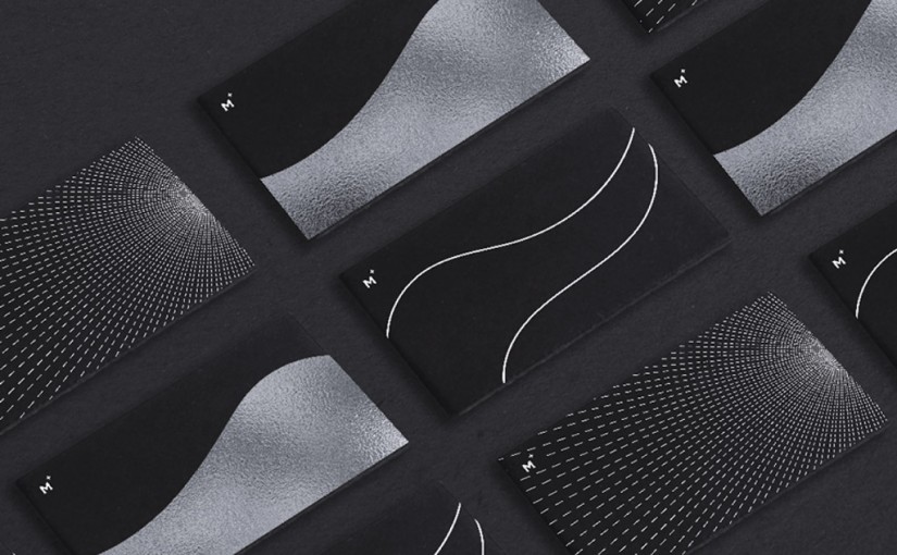
However, there are some examples that still translate well enough to form a strong product or brand (conceptual or not). The following is a visual identity for a fictional film studio called Magnet. The visual elements stem from the shape and forms of magnetic waves and cinematic light while the black and white palette was inspired by early cinema.
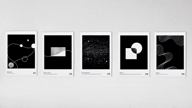
The posters below show abstract visual translations of all the aspects that make up a film. These executions are a great example of balancing negative space and meaningful elements.
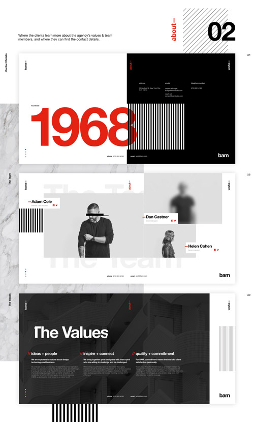
Another important aspect of this style is typography. Multiple font variations paired with an abstract grid allows for some creative layout ideas. The great thing with minimalist design is that when even minor elements are added the dynamic can change dramatically. Also introducing imagery and colour means each element has a purpose and the grid can be used to its full potential. Below is a great example for an architecture studio with the concept behind it being the invisibility of good design.
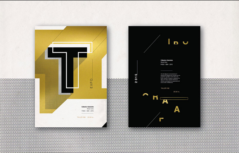
On the subject of typography, below is an example of type traversing piece by piece into the beautifully organised mess that is abstract minimalism. Again we see the combination of a black and white palette with a touch of colour to enhance the effectiveness.
Adam Yeomans
Designer
Recent Posts
- Thanks for visiting our home of creativity
- We’re excited to be winners of four awards at the MENA Transform Awards
- The Power of Packaging
- The Simple Pleasures of Abstract Minimalism
- So much more than random scribbles
Archives
- June 2020
- March 2019
- May 2018
- April 2018
- March 2018
- January 2018
- December 2017
- November 2016
- October 2016
- August 2016
- July 2016
- June 2016
- May 2016
- March 2016
- February 2016
- December 2015
- November 2015
- October 2015
- September 2015