Graphic Design Trends for 2016
February 9, 2016
By now, most of you reading this are well into your 2016 briefs, creative, revisions, production and perhaps even, campaign evaluations. But let’s take a step back and look at how the graphic design trend has evolved from 2015 and what’s in store for us this year.
If 2015 taught us anything, it’s that we are leaving over-designed graphics and moving to clean shapes, muted colours and unique typography. Here is a quick snapshot on what I believe is how 2016 will unfold… graphically.
Colour
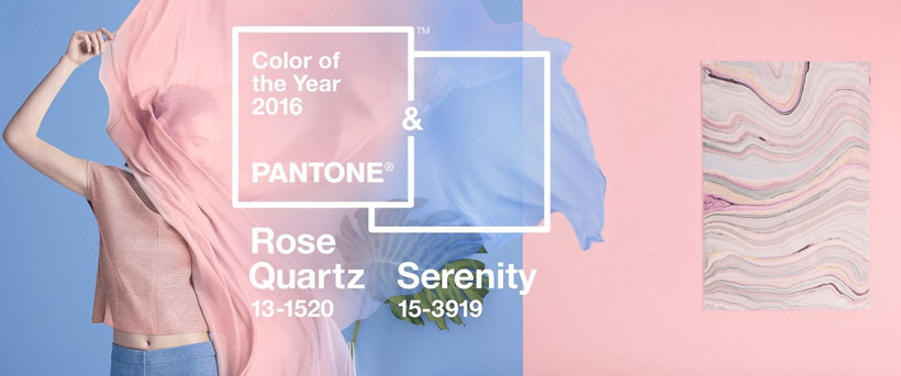
A few days ago Pantone announced its 2016 colour of the year. which are actually 2 colours - 13-1520-TCX (Rose Quartz) and 14-3919-TCX (Serenity). It’s clear that 2016 will be calming, but colourful with muted tones of otherwise bright and bold palettes.
Flat/Semi Flat graphics
Thanks to Apple’s flat iOS icons reveal in 2014, the trend continues to favour clean and flat designs. However, in 2016, it will start moving into a semi flat design, giving it a 3D feel, which solves all the problems a flat design created.
Typography
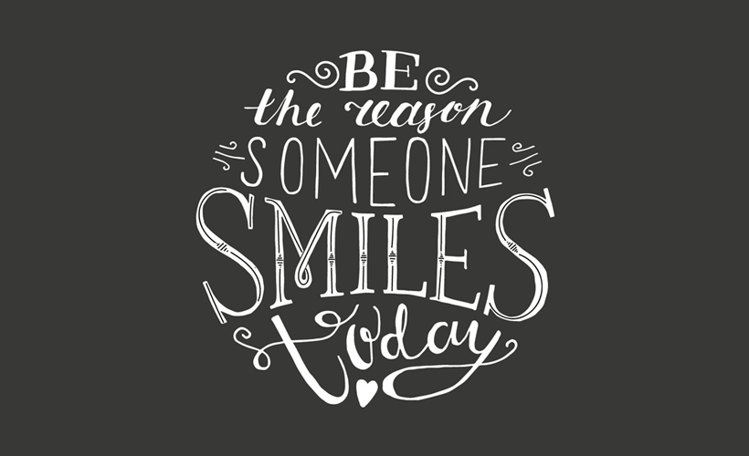
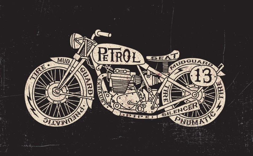
While I’m not going to argue about the relevance of Helvetica, it certainly took backstage last year in favor of handwritten typefaces and will continue to do so.
Illustration and graphics
Like hand-lettered typefaces, illustration style is moving to hand drawn illustrations, which will ultimately leave a very lively experience for the users.
Bold Patterns
A re-imagination of the 1950s style lends itself to bold prints with retro style. The use of shapes keeps this trend simple and clean.
Web Design
In 2016 grids and interactive graphics are the way to go. It’s the perfect solutions to great responsive design that adapts to various screen sizes.
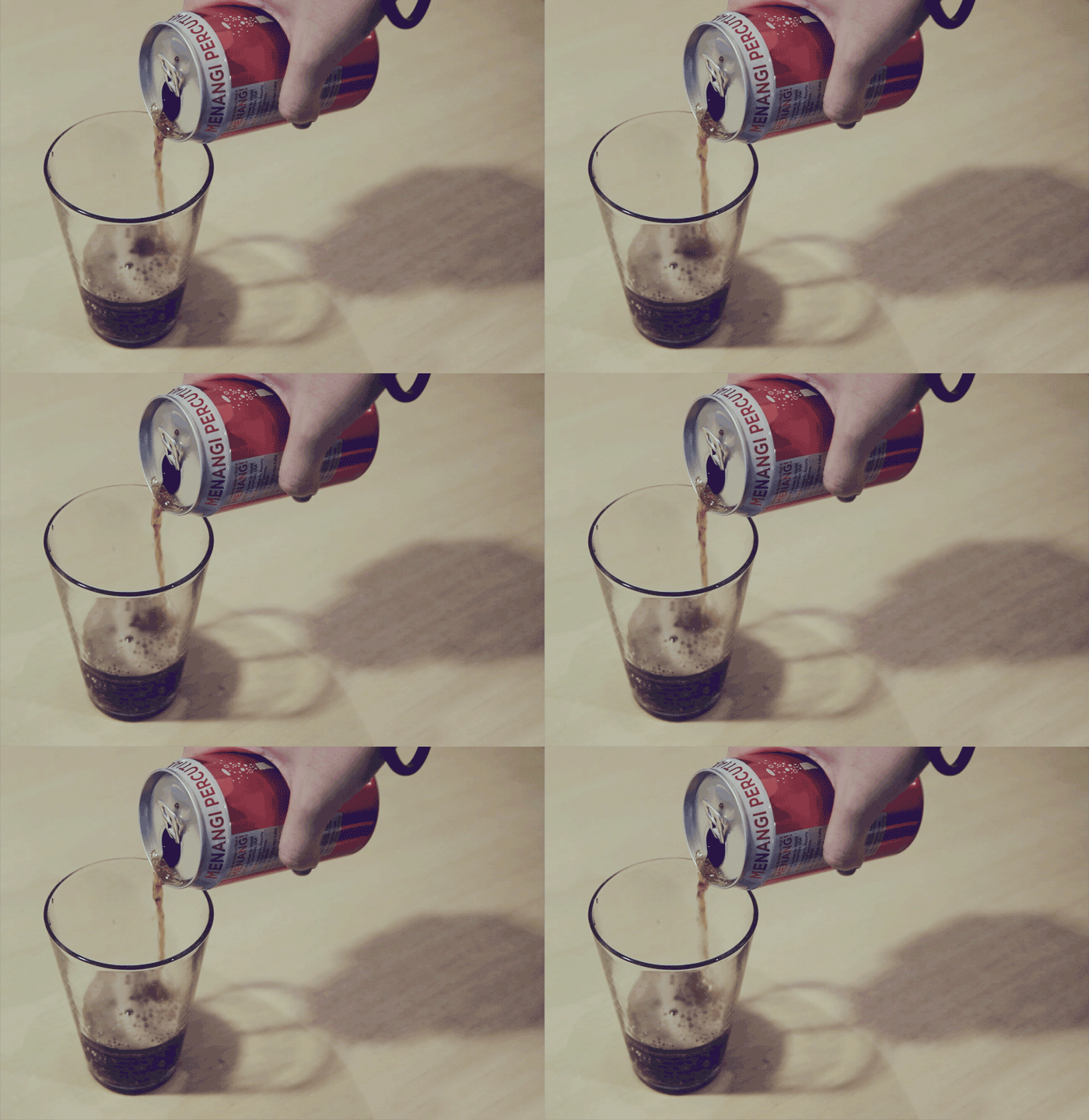
The use of interactive graphics is a great way to introduce your product or service to new customers, or learn more about existing customers as they navigate their way through an experience. Instead of animated graphics, people will use cinemagraphs (animated images) because it will give the feel of a photograph and a video altogether.
Gabor Baboth
Senior Designer
Recent Posts
- Thanks for visiting our home of creativity
- We’re excited to be winners of four awards at the MENA Transform Awards
- The Power of Packaging
- The Simple Pleasures of Abstract Minimalism
- So much more than random scribbles
Archives
- March 2019
- May 2018
- April 2018
- March 2018
- January 2018
- December 2017
- November 2016
- October 2016
- August 2016
- July 2016
- June 2016
- May 2016
- March 2016
- February 2016
- December 2015
- November 2015
- October 2015
- September 2015
